개요
제가 실제 업무에서 담당하는 제품의 스타일 작업은 scss로 개발되었습니다. 전부요. style 코드가 script 코드보다 많은 컴포넌트 파일도 많았습니다. 유지보수에 적합하지 않다고 생각했습니다. 그래서, components 템플릿을 찾아서 사용하면서, 템플릿의 장점과 사용방법을 공유하려고 합니다.
| 직접 css로 style 작업 | Vuetify 템플릿 사용 | |
| 장점 | 🤔. | - 개발 생산성 증가. 빠르게 개발 가능. - UX 좋아짐. - css 코드를 작성할 일이 거의 없음. 유지보수 관리에 좋음. - 얼마든지 디자인 요구사항대로 커스텀 가능. - 정적 파일 img를 사용하지 않고, icon을 넣을 수 있음. |
| 단점 | - 개발을 할 때, 작업 시간 많이 걸림. - css 코드가 많아져서 관리에 어려움. - UX를 좋게 하려면 더 많은 css 코드가 들어가야 함. |
- Vuetify 문법을 조금 공부해야 함. |
오히려 css는 코드를 안 쓸 수록 좋다고 생각했습니다. 개발자가 css를 작업하는 것 자체가 비효율적이고 좋은 사용자 경험을 줄 수 없다고 생각했습니다.
Vuetify 템플릿 사용해서 개발하기
Vuetify UI Components에 커스텀 style 적용 예시
Vuetify가 제공하는 UI 요소만으로 디자인 요구사항대로 구현하기에는 무리가 있습니다.
Vuetify가 제공하는 UI 요소에 커스텀 style 설정이 필요할 때가 있습니다.
이런 상황에서 저는 ::v-deep 키워드를 맨 앞에 넣어서 vuetify UI요소의 클래스 이름 정보를 개발자 도구에서 가져와서 원하는 style을 적용하는 방식으로 디자인 요구사항을 충족시키고 있습니다.
예시1
.v-expansion-panel-content::v-deep .v-expansion-panel-content__wrap { // 👈 ::v-deep
  padding: 0 !important;
}

//or

::v-deep .v-pagination__item {    // 👈 ::v-deep
    background-color: red !important;
    min-width: 20px !important;
    height: 20px !important;
}
예시2 : v-automation border 색상 수정하기
v-text-field 요소에 outlined 속성을 준 요소입니다. 그런데, border의 색상을 변경하는 옵션은 vuetify에서 제공하지 않습니다. 그래서 커스텀 설정을 해 주었습니다.
::v-deep fieldset {
    color: rgba(0, 0, 0, 0.12) !important;
}
전. 후.


Vuetify로 Display Style 설정하기

<div class="d-flex"></div>  // display="flex"
<div class="d-block"></div> // display="block"
<div class="d-none"></div>  // display="none"
Vuetify html 요소에서 flex 구현하기
예시
아래의 화면 요소들 다음 코드로 금방 만들어 줄 수 있었습니다.

<header class="d-flex justify-space-between">  <!-- 👈 d-flex justify-옵션-->
   <p class="text-h2">Report Name</p>
   <v-btn color="error" @click="deleteReportSubmit()">REPORT DELETE</v-btn>
</header>
가볍게 vuetify flex 설정 문법을 알아보겠습니다.
| css | vuetify | |
| flex 가로 정렬 | { display="flex"; flex-direaction="column" } |
class="d-flex flex-column" |
| flex 세로 정렬(defualt) | { display="flex"; } |
class="d-flex" |
| justify-contents="space-between" 정렬 | { display="flex"; justify-contents="space-between" } |
class="d-flex justify-space-between" |
| align-items="space-between" 정렬 | { display="flex"; align-items="space-between" } |
class="d-flex align-space-between" |
grid 사용하기
grid는 vuetify system에는 v-row와 v-col 태그로 사용해야 합니다.
<v-row></v-row>, <v-col></v-col> 사용
<v-row>
  <v-col cols="3"></v-col>
  <v-col cols="6"></v-col>
  <v-col cols="3"></v-col>
</v-row>
vuetify 텍스트 스타일 문법
https://v15.vuetifyjs.com/ko/framework/display
https://v15.vuetifyjs.com/ko/framework/alignment/
텍스트 overflow 설정 문법
<div class="col-2 text-truncate">👉 https://vuetifyjs.com/en/styles/text-and-typography/#wrapping-and-overflow
<template>
<div>
<!-- Block level -->
<div class="row">
<!-- 👇 div or p에서 텍스트 오버플로우 처리-->
<div class="col-2 text-truncate">
Suspendisse faucibus, nunc et pellentesque egestas, lacus ante convallis tellus.
</div>
</div>
<!-- Inline level -->
<!-- 👇 span에서 텍스트 오버플로우 처리-->
<span
class="d-inline-block text-truncate"
style="max-width: 150px;"
>
Suspendisse faucibus, nunc et pellentesque egestas, lacus ante convallis tellus.
</span>
</div>
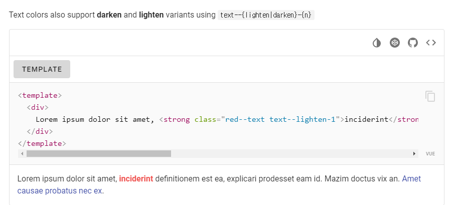
</template>텍스트 색상 지정 문법
<p class="색상--text">
/*
* 색상
* primary
* error
* success
* warning
* ...
*/
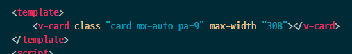
v-card, v-sheet
boder-radius, box-shadow, width, height, max/min, background-color 등 옵션을 v-sheet 태그에 옵션으로 화면 요소를 그릴 수 있어서 많이 사용함.
너비 100% -> class="mx-auto"
v-input 요소
v-select 요소
스크롤 상단으로 이동시키는 버튼 기능
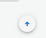
<template>
 <!-- ... -->
<v-btn class="scroll_to_top mx-2" fab @click="$vuetify.goTo(0, options)"><v-icon color="primary">mdi-arrow-up-thick</v-icon></v-btn>
</template>

<style>
.scroll_to_top {
    position: fixed;
    bottom: 20px;
    right: 5vw;
}

</style>
요소 너비, 폭, 높이 조절
v-container에 fluid를 사용하면 좌우 내용을 꽉 채울 수 있습니다. width: 100%로 동일한 효과
<v-container fluid>
</v-container>
반응형 Vuetify 개발
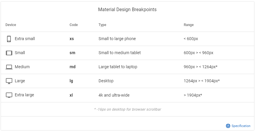
breakpoint는 Vuetify의 기본 설정 브레이크포인트 기준에서 현재 뷰포트 너비 크기를 비교해서 boolean 타입 반환합니다.
this.$vuetify.breakpoint.브레이크포인트 코드 = true | false;
예시

인터넷이 안 되는 환경에서 v-icon이 표시되지 않는 문제 해결 방법
참고: https://kodlogs.com/blog/8152/vuetify-with-icons-and-fonts-without-internet
1. npm 설치
npm install @mdi/font2. @/plugins/vuetify.js 설정
import Vue from 'vue';
import Vuetify from 'vuetify/lib/framework';
import '@ mdi / font / css / materialdesignicons.css'; // 👈 Ensure you are using css-loader

Vue.use(Vuetify);

export default new Vuetify({
    icons: {
        iconfont: 'mdi', // default - only for display purposes  // 👈
    },
});
vuetify v-checkbox 체크 동작 하는 법
cy.get('#percent').check({ force: true });checkbox 체크 유무 확인
cy.get('#percent_text_annotation').should('not.be.checked');
cy.get('#percent_text_annotation').should('be.checked');
checkbox disabled 테스트하는 방법
cy.get('#percent').should('not.be.disabled');
cy.get('#percent').should('be.disabled');
block 요소 배경색 설정
<div class="grey lighten-4" />요소에 cursor 옵션 설정
'Vue.js' 카테고리의 다른 글
| [Vue Test Utils] Vue 테스트 코드 작성 방법1️⃣- 테스트 환경 설정 및 간단한 테스트 코드 작성 방법 (0) | 2021.08.05 |
|---|---|
| [Chart.js] Vue에서 사용하기. (7) | 2021.07.26 |
| [vue][업무] 404 페이지 만들기 (0) | 2021.07.15 |
| [Vue][업무][베트남🇻🇳]webpack의 모듈 시스템을 사용한 alert와 confirm 개발하기 (0) | 2021.07.12 |
| [Vue] Virtiual DOM과 Vue 렌더링 원리 알아보기 ✏️ (2) | 2021.06.27 |


댓글